Thursday 23 May 2013

Welcome to the New CG A&A Blog

The CG Arts & Animation Group Blog is a central hub for the course, a hive of ideas, shared thoughts and inspirational work. It has been developing over the past few years into something quite extraordinary, but also, something that needed a little bit of control. It is for this reason that a redesign has been on the cards. The tricky part was creating a design that sat quite calmly in the background  allowing the work and content to be the focus. For this reason, we have produced this simplified, sparse design. Allowing for easy navigation, visible content and fast page loading. Before I mention some of the changes, here is a test post to demonstrate how the new blog will be an improvement for content display.

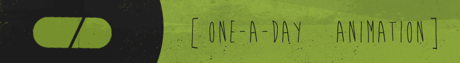
So, today's one-a-day animation is titled Ark. Not only is this short animation an incredible demonstration of the 3 act narrative but shows just how important style and art direction are to binding a short together. The narrative examines a world that has been almost devastated by a virus, the survivors of which board the final arks and travel out to find new land. It is a great example of the 3 act structure, the world and narrative is set up and explained to the audience. A problem then arises which alters events, and finally the third act conveys the solution or twist to this problem.


One of the first goals was create a film with vision that will last in the viewers mind. To create a story that matters and keeps the audience thinking after they leave the theater. - Brothers Quay films had a huge influence on the decision to use miniatures for ARK. And when it comes to the lighting the first ALIEN movie made by Ridley Scott was probably the biggest influence. You’re right about the influence of eastern European animation; they have a very distinguished and twisted style. I cannot point to one particular artist or production right now but it had an impact mostly character design.
For those interest in the making of the film check out the official website and CG Society article on the piece...
http://www.thearkfilm.com/index.html

As you can see, content is much larger, with emphasis on the visuals being shared. The images and videos can be embedded at 900 px. This will make the blog a much easier viewer platform. It takes the approach of an art gallery, with little in the background, allowing the work to take centre stage. The colour scheme matches this approach, a subtle and unobtrussive grey with a accent of green. Again, content is the focus.

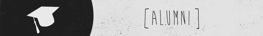
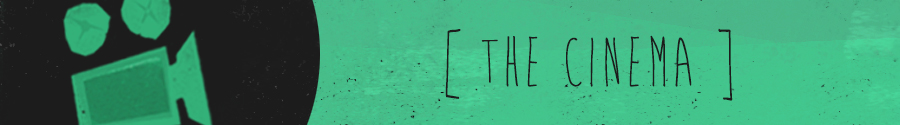
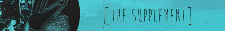
To help with navigation a set of banners and icons have been created. These represent the key labels that identify posts. Whether this be the One a Day animation post, or the PWTM, they will allow users to get to the content they want to see a lot quicker. These banners can be identified easily by colour and icon, and will be placed at the top of the post to instantly communicate the simple message. The right hand panel allows you to access this feature whenever it is needed. Along with this, a list of useful links, recent popular posts and a monthly poll will be posted. The top bar of tabs will show links that are more course focussed. They represent important information that students may need to access at any time.

The number of posts per page will also be lowered, this will make the blog a lot faster to load. The key is really to make the site a very quick, friendly and visible place to share information. The final aspects of the design will be completed and implemented this weekend. Over the coming weeks further aspects will be added as they are required, but hopefully this simple design allows for a very solid and functional base for the blog. Keep an eye out for the big change over and enjoy the new blog!

Wednesday 22 May 2013

CGAA Design - Marc Newson


Marc Newson


"I'm proud to say I'm a geek. You have to be a geek...Good designers are geeks."

Born in Sydney, Australia and growing up in the age of the moon landings, Marc Newson combines retro and futuristic design to create products that are hugely unique. He seems a man who is incredibly influenced by the want for things to improve. The annoyance of bad design, bad products and bad interaction have motivated him forward to simplicity. The simple principles of design are clear with every piece he creates, merging simple function and sculptural form. From chairs to cars, cutlery to spaceships, Newson has worked on projects of all scale but retains this simple and modernist form that instantly stand out as his own.

"For me it's design...it's the same skill that you apply to all of these thing. The materials change. The scale changes. But beyond that, really, I solve the problem as it arises, or as it is presented to me."


He commits these ideas of design across all of his products, refining and implementing until the final outcome is a simple, working product. The want to make things simple is understandable, in a world where badly designed products overcome us and make every step that little harder, this simplicity is not only a refreshing step forward but also a glimpse back to the retro past when everything seemed a little easier.

"Marc Newson matters because he is different in a world of sameness."
                                                                                                                   - J Mays


"I'm proud to say I'm a geek. You have to be a geek...Good designers are geeks, bad designers are not geeks. I think there is a correlation. Geeks are interested in detail. They are obsessed. They are interested in the minutiae of how things work. And if you are not, then how can you really know what you are doing."

Every piece that Newson designs seems to capture the same cleanliness and simplicity, this eye for detail and the want to refine is part of Newson's success. It is an obsession of making a product as perfect as possible. The curves and materials on his work are finished to the nth degree, with master craftsmen working on every aspect. From the finished metal of his chairs to the fully furnished boutique  he is a man of complete ownership. His interiors reflect his style in a more encompassing manner, with the retro / futuristic mix creating an almost filmic aesthetic, as though set designs for a 70's sci-fi.


“I think Marc is fairly peerless now. Marc’s forms are often imitated, but what other designers seldom imitate is his preoccupation with materials and processes. You have to start with an understanding of the material. Often your innovation is just coming up with a new way to use material.”
Jonathan Ive

Marc Newson appeared in a superb episode of Imagine some years ago, a must watch for anyone interested in the process of product design. It also shows some interesting uses for the emergence of 3d printing.


Further Reading and References
Marc Newson Website - http://www.marc-newson.com/intro.htm

Tuesday 21 May 2013

Header Rethink

So, less colour and a touch of marketing. If this is way off, let me know, but I think this green might work better along with a very simple desaturated colour scheme. The blue reminds me too much of my own work, this seems a bit more subtle but readable?


Test - One a Day - A Good Wife


Illustrator W. Scott Forbes' A Good Wife - a poignant, filmic short, in which environments are used to great effect and actual 'animation' is minimal. The long slow zoom that concludes the film is like a drawn out ache of loneliness and ennui - a clear example of how a choice of shot actually creates emotional content.

Banner Updates

So, here are the changes made to the banners for each specific post. These will transfer across to tabs on the sidebar as well, which I'll be uploading a little later.


I'm also still not too sure about the colour banner at the top of the page so I'll be messing around with that for a little while. Any opinions on what the header banner should be like? It's just something that's been nagging me. More soon.

Thursday 16 May 2013

Graphics Update

In preparation for the launch of the website, I've created distinct headers for each post type. These are all formed ready to simply add to each post when needed. Each is colour coded so hopefully they can be identified from the blogger front page.


I've also made some temporary changes to a possible heading. Some crits and comments have suggested brighter colours and initially we did talk about a Neapolitan ice cream type feel. So I've tried this variation of the title out. It's pretty simple and introduces some of the recurring colours of the headers. Let me know what you think, it may all be too much but we have some time to try it out before next week.


The next stage is to get the thumbnail headings done, then sort out any final tabs etc. Thoughts and ideas about this final stage would be great. I'm adding a video to this post to try and fill out the page, giving an idea of load times etc will help when implementing.


More updates soon.