
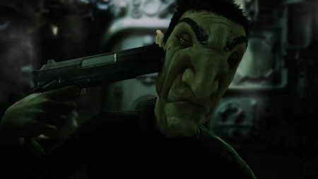
So, today's one-a-day animation is titled Ark. Not only is this short animation an incredible demonstration of the 3 act narrative but shows just how important style and art direction are to binding a short together. The narrative examines a world that has been almost devastated by a virus, the survivors of which board the final arks and travel out to find new land. It is a great example of the 3 act structure, the world and narrative is set up and explained to the audience. A problem then arises which alters events, and finally the third act conveys the solution or twist to this problem.
For those interest in the making of the film check out the official website and CG Society article on the piece...

Hey Jordan - ooh, it's looking very swish and nicely balanced now - and you should definitely go ahead and re-boot the 'golden star' PWTM icon in the same vein. I really like the title font, but just think that maybe the actual title should be less 'Animation' only, because the course is moving increasingly into toy design etc. So maybe just THE CGAA BLOG? What do you think? Anyway - I'm liking it a lot, so thanks so much for persevering :)
ReplyDeleteHi Phil, thanks for the feedback. Title issues should be easy to fix, I'll keep thinking about it but CGAA is a possibility. Maybe something with a bit more info..."The CG Arts Blog"?...I'll test a few out and refine what we have so far.
ReplyDeleteThe only 'problem' with 'The CG Arts Blog' is that there's a Computer Games Arts degree in Farnham and we're keen obviously to make the distinction... I keep thinking we could dispense with it completely because we've got the course title on the right - so the title could be something else entirely - like Nurb! or Phong Thing - and perhaps the title on the right could read 'The CG Arts & Animation Blog' - this could be a RUBBISH idea, of course - but if we're seeking to create an internal course identity we could dial back the word Blog and dial up something more catchy?
DeleteTo be honest, the whole Nurb! thing is making me cringe... I think it should simply be The CGAA Blog ...
DeleteHaha, I think you could be right. Keeping it this simple seems like the best way forward. I'll make the changes later today and then we can work out the details tomorrow.
DeleteHi Jordan, so far this is a neat reboot of the CG blog, carries the CG moniker well and breathes in a lot of modern air. However, upon first glance I instantly thought: "Jordan 2.0" (a hint of sombre quality that is in your work) and only because I've been so used to seeing those bold yellows and reds belonging to the original blog page. It's the psychology of colours on the original blog page that the attention pointing out mainly deadline “hazards” and important information is going to be changed now. I don’t mean this in a bad way; you've injected some of your distinct style choices in this template that gives me this impression. I think the font can be experimented with/ the main title font and it's weight can be bigger. Also, how the main colour palette will work now with in-post text and highlighting variations. Migrating blogs sounds like a challenge, so these are just some of my viewpoints for you.
ReplyDeleteHi Dayle. Thanks for the feedback, it's all exactly what we need. In terms of colour palette, it will change somewhat, with slightly more saturation on key elements. But as a whole, the darker, milder colours were intentional.
ReplyDeleteI know many will see it as a sombre and dark, but it feels like the CG AA blog needs to change how we view the community site. Deadlines and alerts are obviously important, but I would argue that the most important aspect of the group blog is the sharing and discussion of animation, film, art, music etc. This is the driving force behind the change. We'd like to see more of the actual work, in short, letting the content take front stage. The design of the site should sit in the background and provide a pleasant gallery to present this content, but also an easy to use interface. This will not only make for a friendlier, relaxed community discussion board, but also help bring in outsiders. People from industry and others interested in animation can see why our course is so unique. We have an incredible community of artists, it would be a shame to lose some of those qualities in favour of an information dump. I'm sure we can come up with a solution that is much more subtle, but still useful to students.
I actually think the "hazard" type design of the current blog is a real problem. Everything is set in bright tones, shouting for attention. This somewhat negates the point of helping information stand out. It all becomes noise in a sea of screaming information. I'd like to think that this new design is a more relaxed approach to the course. A lounge environment where people discuss and share info.
I will definitely think about a solution to your thoughts, maybe an alert post heading? A graphical element that let's students know they should be paying attention to certain pieces of information? I'd like to avoid saturated blocks of text at all cost.